


This feature is only available to premium members
Check out our Premium Accounts
Select your Account Type
I'm a Parent Add up to 6 children
Premium Account Required
Premium Account Required
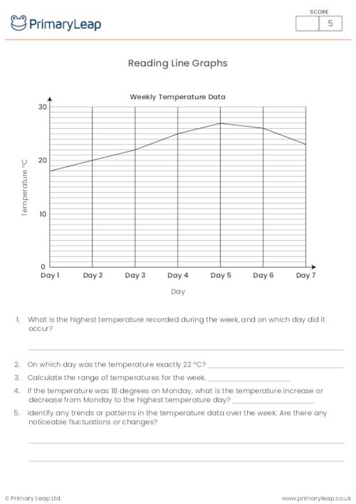
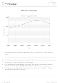
Reading Line Graphs
Use this handy worksheet to help students practise interpreting and analysing data presented in a line graph. The line graph displays temperature data over the course of a week. Students will engage with the graph to answer questions that require them to identify temperature trends, extremes, and averages within the dataset. This worksheet can be used effectively in the classroom for interactive learning. Educators can provide guidance and facilitate discussions as students work on the questions. It is also suitable for homework assignments, allowing students to practise their data analysis skills independently. This activity can be a valuable addition to the curriculum for reinforcing data analysis and visualisation skills, both in the classroom and as homework.
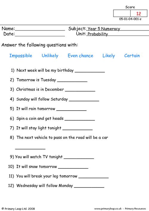
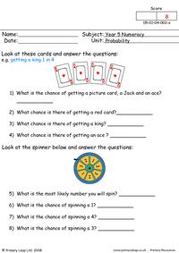
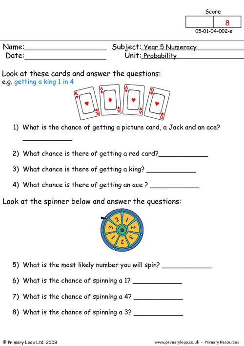
Math: Probability - Answer these questions with impossible, unlikely, even chance, likely or certain
Math: Carrol diagram - Look at the numbers and write them in the correct place. Are the numbers mult

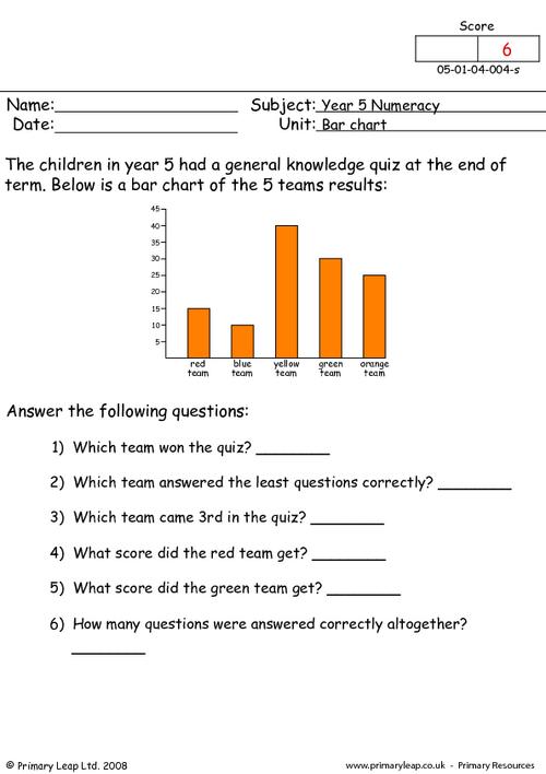
Math: Bar chart - Bar charts are a visual presentation of categorical data. Look at the bar chart an
Math: Line graph - Look at the line graph showing information about rainfall in Manchester and answe
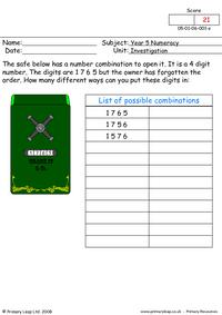
Math: Investigation - How many different ways can you write the 4 digit number for the safe.

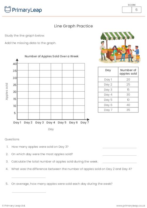
Line Graph PracticeThis worksheet helps students improve their skills in interpreting and creating l
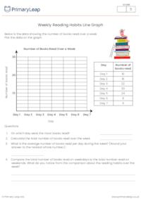
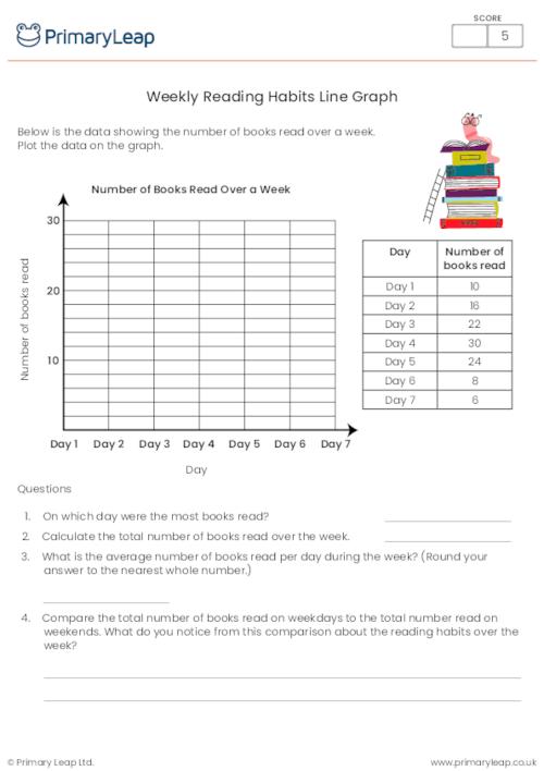
Weekly Reading Habits Line GraphThis worksheet is designed to help students practice interpreting li

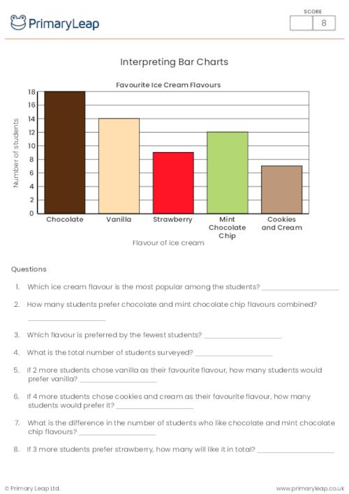
Interpreting Bar ChartsThis worksheet is designed to help students develop their data-handling skill

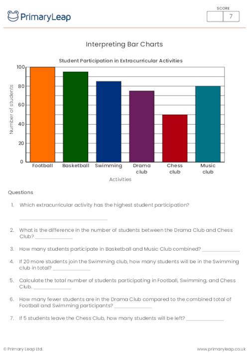
Extracurricular Activities Bar Chart WorksheetThis handy maths worksheet will help students develop
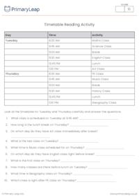
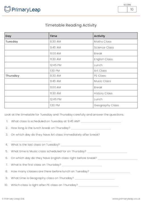
Timetable Reading ActivityThis worksheet will help pupils practise reading and interpreting timetabl
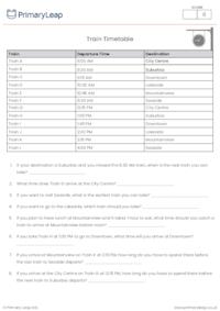
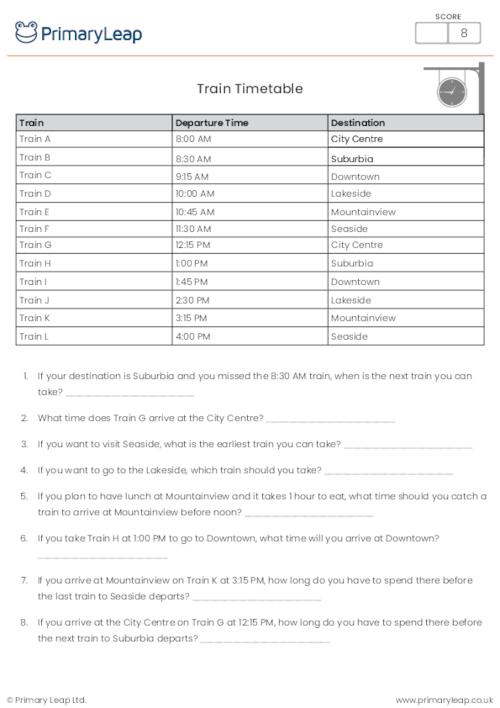
Train Timetable for a Day ActivityThis worksheet is designed to challenge students in reading and in
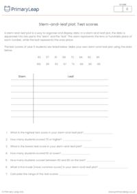
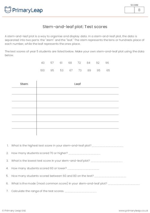
What is a stem-and-leaf plot? A stem-and-leaf plot is a way to organise and display data. In a
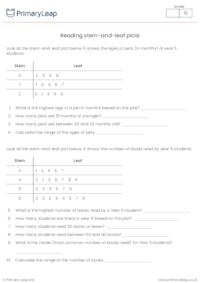
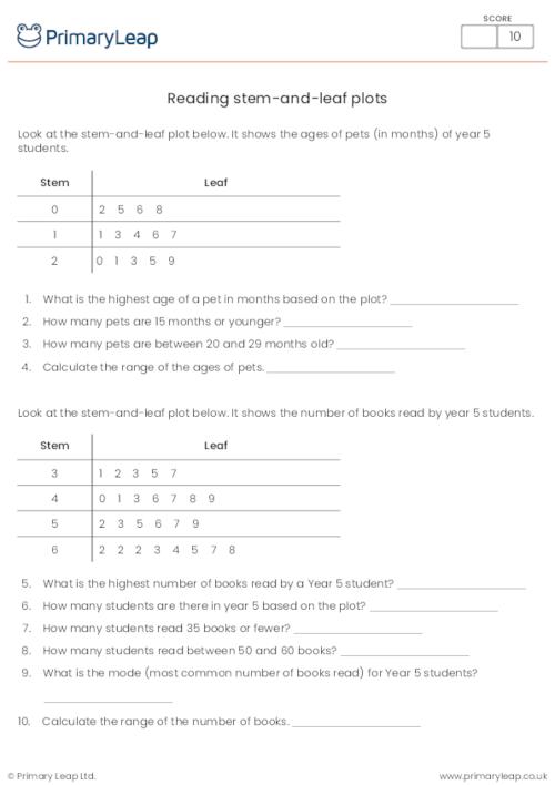
Reading stem-and-leaf plotsThis worksheet is designed for students to practise interpreting stem-and
Reading Line GraphsUse this handy worksheet to help students practise interpreting and analysing dat
An email has been sent to your account please activate your account to continue.

Select your Account Type
I'm a Parent Add up to 6 children
PrimaryLeap has introduced a new interactive learning platform and would like to offer you a completely Free Upgrade.
We understand that you may only want to use our services for worksheets and may not want to upgrade your account.
But if you are interested in trying out our new services then you're just a click away.


An email has been sent to your account please activate your account to continue.
You've answered
and have 2 Questions remaining
Import multiple students information through a CSV File. Browse or drag .CSV file below.